


Blabler
OVERVIEW
Blabler is an education platform that helps kids improve speech and prepare for school, by providing lessons with teachers, tracking all learning and providing goals driven guidance.
This a personal project that we did outside of work hours, where we spent a large amount of our spare time and weekends working closely with the founder and a small team of engineers to build the vision.
View Website
Stack
Tilda, Bubble
Time
12 weeks
Location
Russia
Tilda, Bubble
Time
12 weeks
Location
Russia
ROLE
Product Design, Marketing, Illustration, Development Product Strategy, User Research, Interaction, Visual design, Prototyping & Testing, Information Architecture, A/B & Click Tests, Pitching, Product Developing
Product Design, Marketing, Illustration, Development Product Strategy, User Research, Interaction, Visual design, Prototyping & Testing, Information Architecture, A/B & Click Tests, Pitching, Product Developing
Product video review
Understanding the problem
Speech therapy. In Russia today, 58% of children have speech therapy problems. Moreover, for one a teacher in kindergartens has - 420 children. And in the world, according to WHO statistics for 2019, the number of children with speech impairment increased by 270%, and this figure continues grow.
Then we discovered the top frustrations:
Lack of a speech therapist in some kindergartens. Most parents feel frustrated by the lack of a speech therapist in the kindergarten or the lack of space in a speech therapy group.
Lack of reading and writing in the preschool plan. Only 40% of children graduating from kindergarten can read and write. The rest of the parents feel anxious about the lack of these disciplines in the curriculum.
Knowledge gap. There is a gap between what is taught in kindergarten and what is expected in school, which makes students feel unprepared for learning. Parents fill this gap only partially.
Lack of a well-functioning educational process. Online and offline courses do not teach material interactively. Most often, a child works with a speech therapist using outdated methods that do not take into account the interests of the child. The class also lacks an element of play and the child begins to get bored within 10 minutes after the start of the lesson.
Bad infrastructure. Teachers would like to use more technology for educational purposes, but their kindergarden infrastructure is inadequate and there is a lack of easy-to-learn and helpful software. There are also regular room changes, unreliable technology and Internet connectivity, too few devices, hardly any maintenance of the technology, incompatibilities between programs and devices (e.g., smartboard not powerpoint enabled), and high setup times (e.g., slow build / install).
Prohibitions at kindergarden. Most kindergardens prohibit smartphones, offer open Wi-Fi, block mobile reception, and / or prohibit using private laptops or tablets in the classroom.
Technology aversion. Many teachers are critical of the use of digital devices because they perceive them as distracting. They need new, more positive experiences.
Generation difference in the use of digital tools. Great difference in the perception of parents and teachers on how often digital devices are used for educational purposes. Parents say the use of digital devices at their kindergarden is inadequate, while teachers feel they use them relatively frequently to make their lessons.
Preparation for school. With the adoption of the Federal State Educational the standard of preschool education in Russia - at preschool institutions the need to teach the child to read and write has disappeared. At the same time, psychologists agree that a calm adaptation of the child to school is facilitated by preschool preparation aimed at developing writing, reading and counting.
We created questions for an online survey that was answered by 202 people (about 75% parents, 25% teachers) within one day – of course this survey is not representative, especially if you still have the differences between younger and more experienced teachers and between the different age groups of parents.
User research & User personas
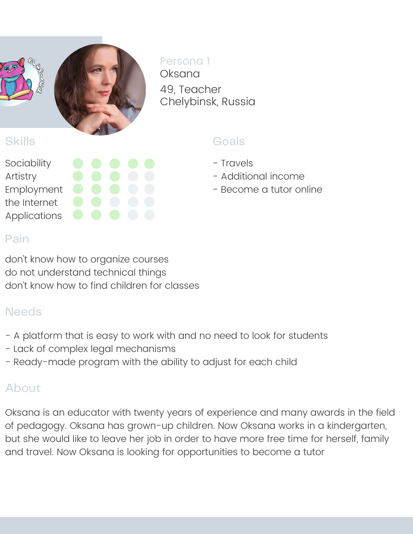
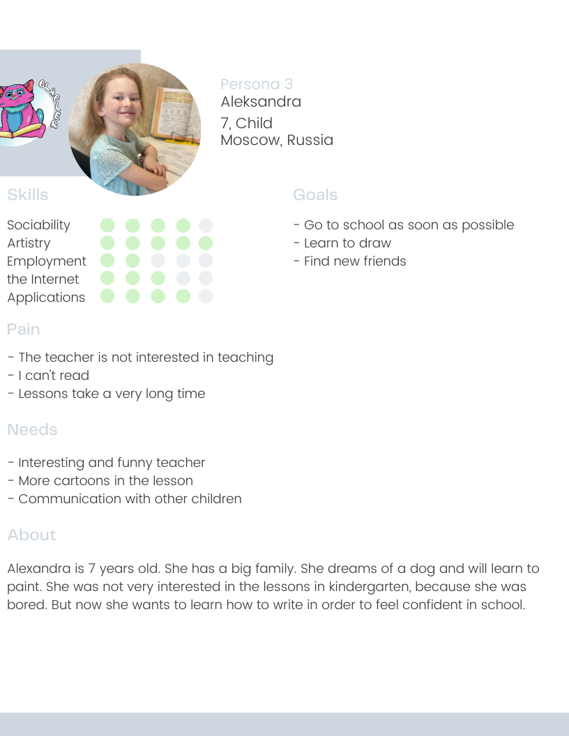
To identify users behavior we were able to carry out User research which was a good tool to creat our User personas. Using quantitative and qualitative data from interviews and survey results, we formed three target group profiles: Oksana (Teacher, 49), Maria (Mother, 30), and Aleksandra (Student, 7) to better empathize with our main user groups and prioritize according to their needs.

The product strategy
As a product, we wanted to position Blabler as the leading speech therapy and preparing school platform. Creating the product strategy was the only way to reach this aim. There were 3 key focus areas we created:
Education progress. We want to help kids achieve their potential of fulfilling their education goal by providing parents with the ability to track their learning and development over time.
Study development advice. We want to provide parents with advice on what they need to do in order to achieve their goal in the form of learning recommendations such as courses, books, events, podcasts, blogs, vebinars etc.
Modern author's teaching methods. Modern author's teaching methods. Creation of personal accounts for kids and teachers. The purpose of the lessons on the platform is not just to monotonously repeat words after the teachers, but to create a comfortable cognitive environment in which the child draws, dances, passes funny quizzes and relaxes, gaining knowledge, and the teacher helps him with this.
In addition to our Product designer services, we were also responsible for the marketing side where we created pitch decks and videos to illustrate the concept of our product and the value that it provides to our users. We created the visual designs, put together the prototypes, the script, recorded and edited the videos to demonstrate our product vision to investors and target users at pitch events and at investor meetings.
Defining the MVP
We conducted workshops and sketching sessions with the team to map out the user flow and come up with a storyboard to capture the MVP.
We identified the following key features:
For a child:
List of recommendations in lessons. Receive a plan of courses, events, blogs, podcasts etc. that parent can do with child to work towards addressing any skill gaps in kids knowledge.
Connecting with teacher. The presence of a stable video link with the teacher during the lesson, as well as the ability to check homework by the teacher on the platform.
Tracking of development. View kids progress over time.
Repetition of material. the ability of parents to repeat the lessons learned by the child over time.
Interactive tasks: provide the child with the following opportunities in the classroom: draw, take quizzes, correlate pictures, dance, communicate with the teacher via video link.
For the teacher:
Schedule for teachers. Interactive panel for teachers to view their timetable and send reminders to parents.
Lesson setup: Ability to edit the lesson during the lesson (hide part of the assignments, see the correct answers, prescribe individual homework)
Available materials: Provide the teacher with access only to those courses that he teaches.
Wireframing, Prototyping & Usability-Testing
User testing was an iterative process that was conducted at every milestone of the project to identify the biggest pain points in the current version. Once feedback was gathered, we would revisit the prototypes and test again.
On the brand side, we wanted to create a refreshing, vibrant and clean user interface that communicates reliability and progress for parent-centered children.
Website
We needed a bright, kid-friendly website with a simple call to action (CTA) that communicates our purpose and value to our target users.
Lessons
Simple and intuitive tutorial interface. On the right is a video link with a student and the structure of the current lesson. from above the ability to change the current lesson, exit it, show and supplement homework. In the lesson itself, the student has the opportunity to draw, emphasize the main thing and move along the assignments with the teacher.
Simple and intuitive tutorial interface. On the right is a video link with a student and the structure of the current lesson. from above the ability to change the current lesson, exit it, show and supplement homework. In the lesson itself, the student has the opportunity to draw, emphasize the main thing and move along the assignments with the teacher.
Paper-Prototypes
With low-fidelity paper prototypes, the planned syllabus and the general structure of the application could easily be tested in usability testing. Without much effort, adjustments could be made before going into the much more costly digital implementation.
Clickable prototypes
After some paper prototyping adjustments, wireframes, mid- and high-fidelity prototypes were created, which we supplemented with clickability using InVision. Again, user tests revealed small vulnerabilities in the structure of the user interface, in some formulations and interactions. In addition, the users asked smart questions, which led to further improvements.
Visual Design
The visual design was developed by iterating from mood boards and styletiles to the UI kit and finally to creating a first version of the style guide.
Student's personal account
In the personal account, the student can: view current and future classes, contact the teacher, see progress and teaching recommendations at the end of each lesson.
In the personal account, the student can: view current and future classes, contact the teacher, see progress and teaching recommendations at the end of each lesson.
Teacher's personal account
In the personal account, the teacher can view his current students, their interests in the profile, check their homework, change their schedule as needed.
In the personal account, the teacher can view his current students, their interests in the profile, check their homework, change their schedule as needed.
A/B & Click Tests
To quantitatively review the usability assumptions, I did A/B and click tests, which confirmed my assumptions except for a few details. First and foremost, we tested the navigation structure on tablet and laptop, the wording of some actions as well as preferences regarding the visual design.
Working process
As part of the future vision, we created a site map of the platform to help Client understand how the overall site architecture worked. The main areas were segmented as follows:
For Child:
Stage 0 - Profile and Account setup. Set up your basic account and view a profile of your course and progress.
Stage 1 - Home. See an overview of your learning, progress, upcoming lessons and teacher notifications.
Stage 2 - Lesson. Video communication with the teacher. Displaying the child's actions in the lesson on the teacher's screen. Interactivity of tasks: tests, listening, drawing.
For Teacher:
Stage 0 - Setting up a profile and account. Set up a basic account and view your course and progress profile.
Stage 1 - Review your timetable and students.
Stage 2 - Materials. See Overview of available courses, student learning notifications.
Stage 3 - Lesson. Video communication with the teacher. Displaying the child's actions in the lesson on the teacher's screen. Interactivity of tasks: tests, listening, drawing.
Work plan
First month
UX research, Creating TR,
User Mapping Story,
Screen prototyping and design on Bubble
Creation of databases in Bubble.
Second month
Landing page design and develop
Connection and integration of pay service, CRM, MailChimp and others.
Designing and developing student and teacher personal accounts and lesson process.
Creation of screens based on prototypes and designs.
Third month
Creation of the Support Service in the form of a web version of the application and a specially created account.
Bug checking and tests. Edits, optimization.
Results and takeaways
Some key takeaways from this project are:
Focus on building an MVP. In a startup, there is only so much time and effort that you can invest so it's important to focus on the features that can deliver the highest value for your users.
Don't worry too much about the detail. At the beggining of our journey, Clients made the mistake of worrying about the look of the UI. Taking a step back and reassessing the user flows helped Clients to reprioritise the UX. Ofcourse it's necessary to care about Usability, but do not set yourself the goal of reloading the product with various gimmicks.
Focus on the problem. Eventually, it is your users pains that you will be solving for so keeping that front of mind is important as it's easy to lose sight of this when you're bogged down in the day to day.
Aware your goal. That is why MVP is called so - Minimum Viable Product. Minimum - uncomplicated but main goals solving. Viable - proves it's necessity and urgency. Product - comlieted self-sufficient. Follow each letter of MVP definition and let it be created the new product.
The project is just entering the market and it has already attracted several tens of thousands of euros in development investments.
Interview with founder
Sinneo is a low-code development studio. If you want to launch business quckly and minimizing your financial costs, you can order the development of a website, mobile and web application, crm systems, task tracker, social network and other IT products from us.
Do you have a fantastic idea to implement? Contact us and let's start!
Do you have a fantastic idea to implement? Contact us and let's start!
Build better with Sinneo.dev
Join our waiting list
Создавайте лучшее с
Sinneo.dev