


Kiwi's manual
OVERVIEW
Kiwi's manual is an e-learning platform for self-education. The service is built as a constructor that allows the admin to create hundreds of different courses. And the user can buy these courses and study them.
Kiwi's manual is an e-learning platform for self-education. The service is built as a constructor that allows the admin to create hundreds of different courses. And the user can buy these courses and study them.
No-code tools
Bubble
Terms
12 weeks
Location
Ukraine
Bubble
Terms
12 weeks
Location
Ukraine
ROLE
Design, Development Visual Design, Prototyping and Testing, Information Architecture, A/B and Click Test, Web Application Development
Design, Development Visual Design, Prototyping and Testing, Information Architecture, A/B and Click Test, Web Application Development
Product video review
Understanding the problem
According to our customer, there is now a demand for self-learning platforms in the global market. These are platforms that do not require an expert, curator or teacher from the platform side. The concept consists of self-study of materials, passing control tests and checking with the correct answers.
The main problem at the moment is the weak usability of such services. Moreover, we are not talking about users, but about the owners of the platforms. It is rather difficult for service administrators to administer platforms, namely, to create courses that have a multi-stage architecture of sections and blocks.
On top of that, the development of such a service takes a very long time. According to code specialists, the creation of such a platform takes from a year to one and a half years, and development costs exceed $21000.
A key aspect of the product is the course builder, which allows you to assemble courses from pre-built blocks.
Based on these introductions, the task was formulated - to create a course builder using the no-code Bubble service.
Product strategy
The product was intended as a designer of courses that the administrator could collect using a layered architecture, filling them with different types of content.
The course designer was supposed to consist of 2 main levels: upper and lower.
The top one included:
1) course card with description, etc.
2) Modules that formed the content of the courses.
The lower one included:
1) Chapters that were the next level after modules
2) Blocks of chapters, which were filled with various content, such as: texts, videos, audio recordings and test questions.
From the point of view of the technical functionality of the constructor, the administrator should have been able to:
1) create modules;
2) create and link to the Chapter modules;
3) create "work blocks" with content inside the Chapters;
4) create "work blocks", which should have consisted of:
• text blocks where informational calculations would be written;
• video blocks where video tutorials, video podcasts or just video lectures on a given topic would be uploaded;
• audio blocks where audio files with useful information would be uploaded;
• test blocks, where tests of different types could be created.
• video blocks where video tutorials, video podcasts or just video lectures on a given topic would be uploaded;
• audio blocks where audio files with useful information would be uploaded;
• test blocks, where tests of different types could be created.
5) Create tests of different answer formats: detailed text answers, "yes-no" answers, and choose one or more correct answers.
6) swap the "Working Blocks" within the Chapter if necessary - that is, change the structure of the Chapter;
7) swap the Chapters within the Module, keeping the architecture of the Blocks within the Chapter;
8) swap the Modules, preserving the architecture of the Chapters included in this or that Module, and the "Working Blocks" located within this or that Chapter;
In fact, we were faced with the task of making a constructor on a constructor.
Prototyping, design and development
Paper prototypes
Using paper prototypes, we easily tested the planned architecture of the N course and the overall structure of the application for "usability" (usability). Without much effort, adjustments could be made before moving on to much more costly digital adoption.
Interactive prototypes
After some adjustments to the paper prototype, wireframes, medium to high fidelity prototypes were created, which we added interactivity with InVision.
Visual design
The design of the product had to be consistent with the corporate identity reflected in the brand logo.
The visual design was developed by moving from moodboards and styles to a set of user interface.
Development. Course creation.
Course Creation: title, description, banner, price, etc.

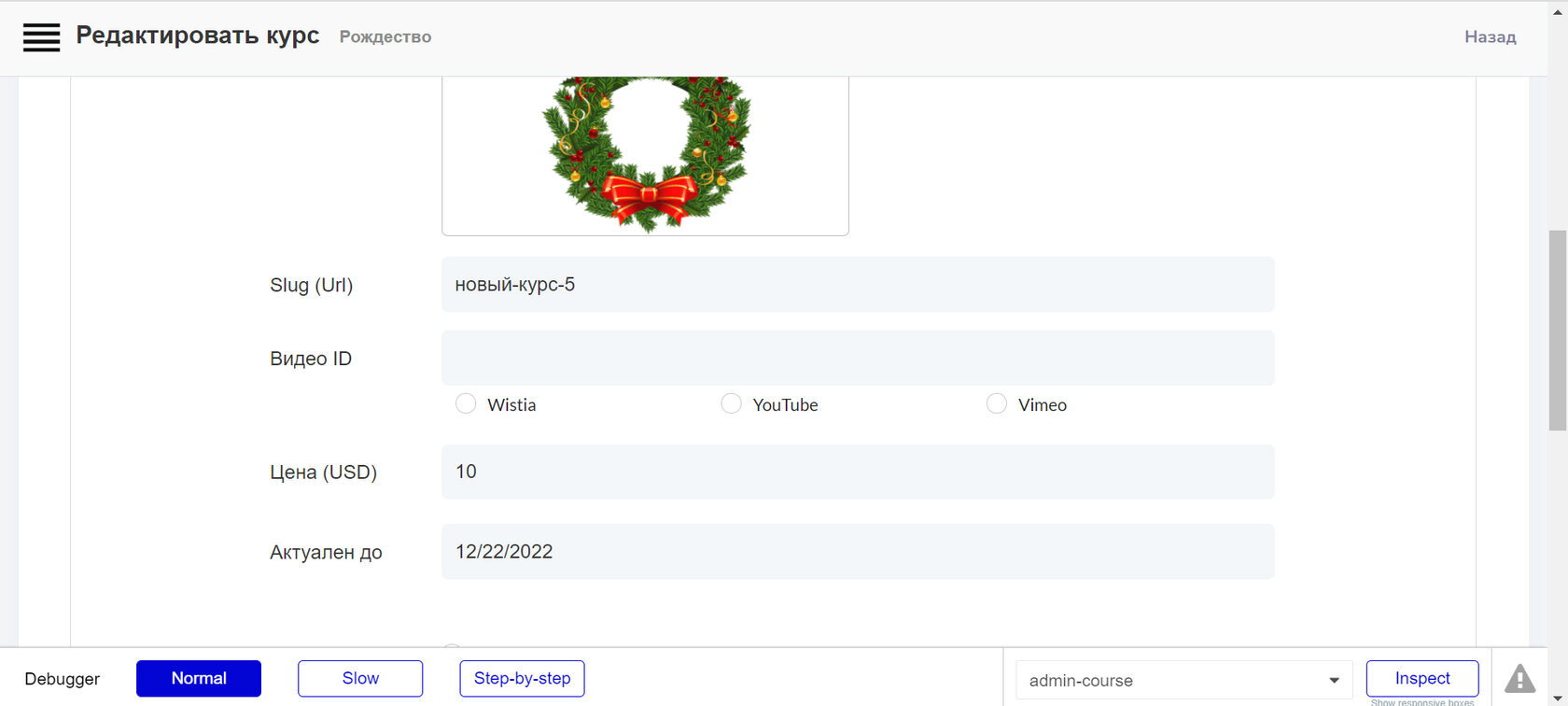
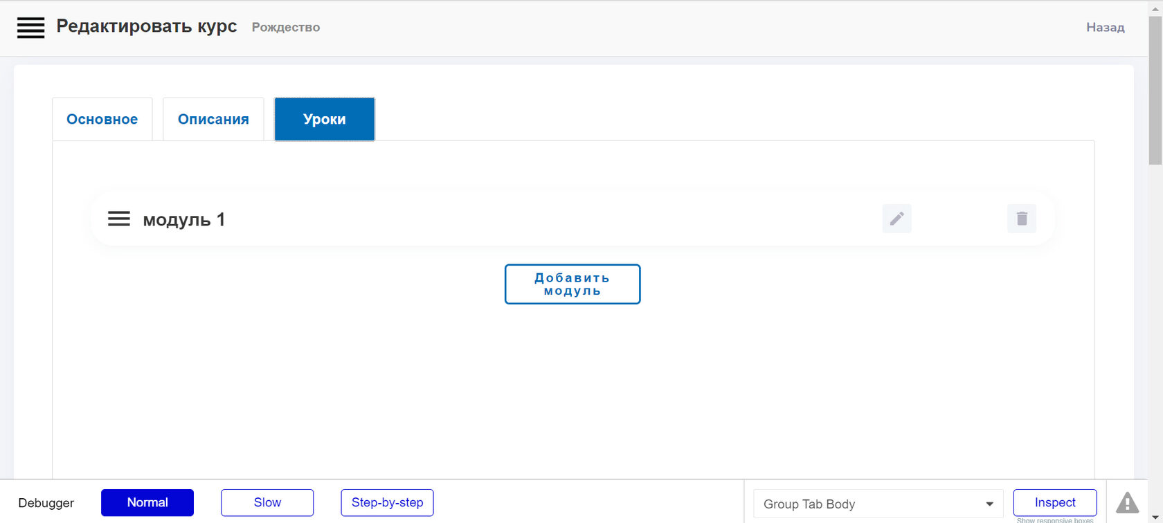
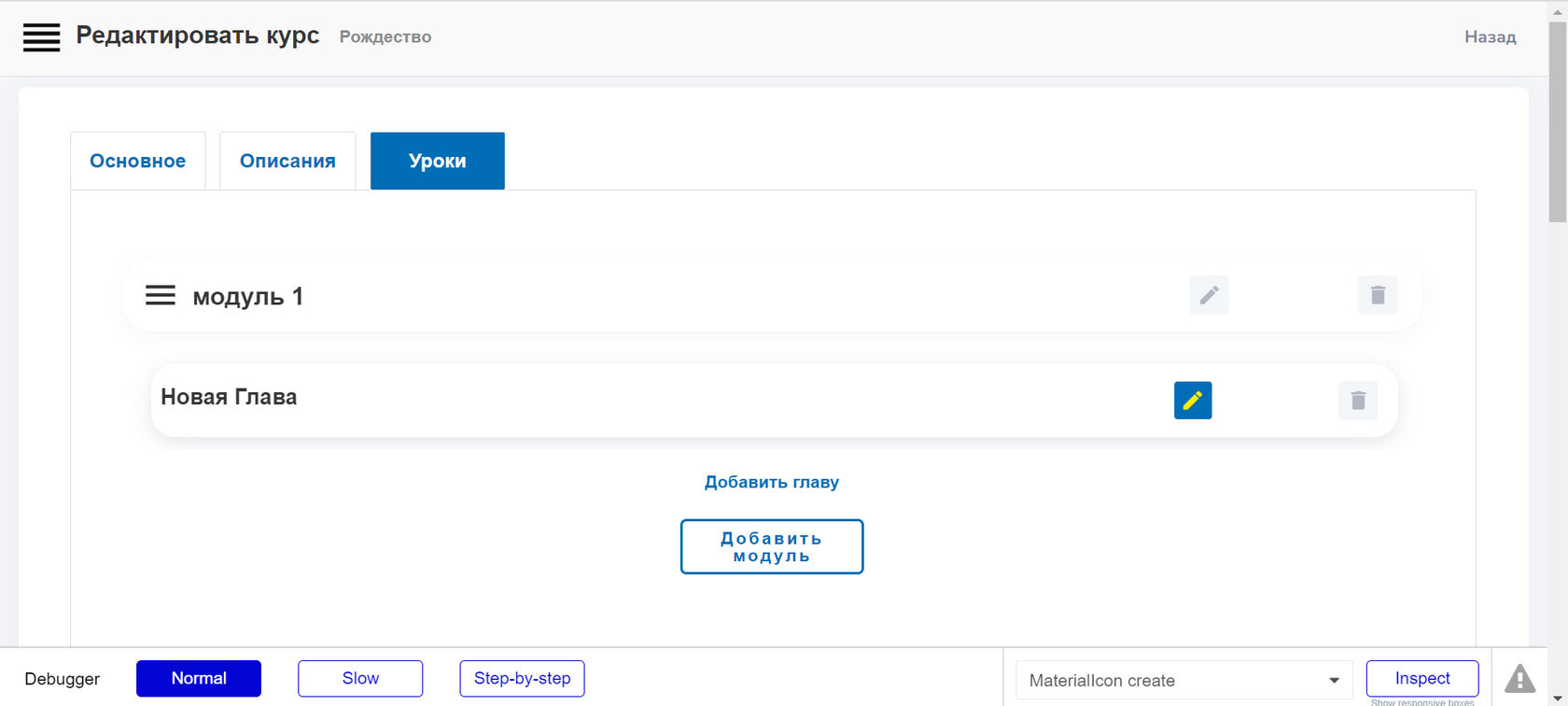
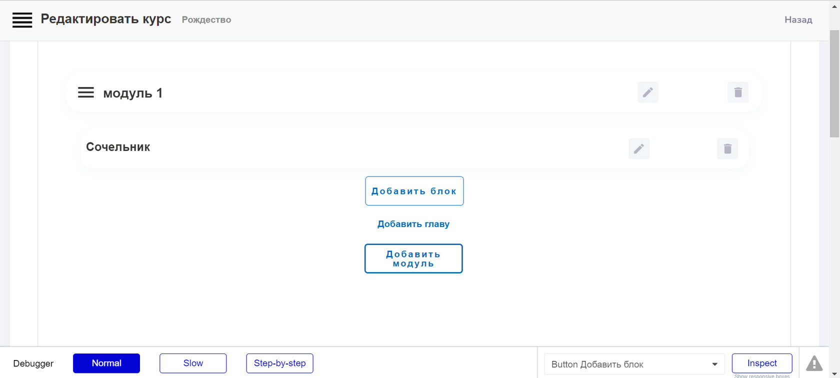
Chapter creation: title, duration.
Module Creation: name.
Creating Blocks is the fun part!
Platform administrator
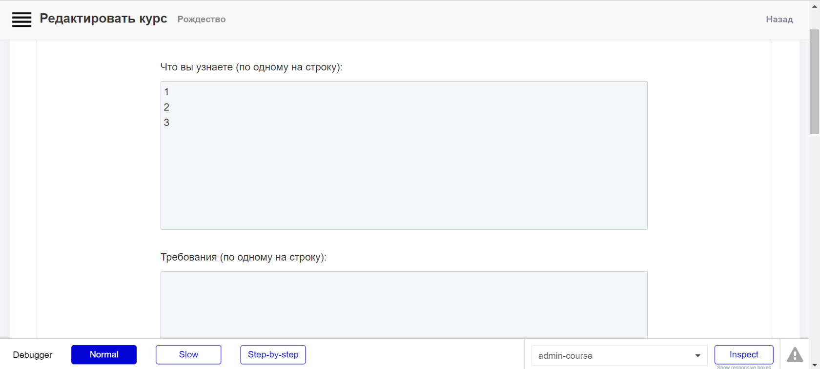
We set a name for the block, and also select the type of the displayed element. That is, we indicate what type of content will be placed in the block: text, image, PDF file, etc.
An example of creating a text block. In a text module, like in Word, you can perform various iterations like Ctrl + B, Ctrl + I, Ctrl + U and others, giving the block a variety of design.
An example of creating a video block. Add a link to the video. We indicate the resource that owns the video - Vimeo, YouTube, Wistia.
Now let's demonstrate how tests are created. Create a block whose element type is called "Task". The question for the assignment is written in the corresponding line. Next, the type of answer that will need to be given to the student / user is formed.
In the first case, it will be "Open Answer". That is, the answer implies a detailed explanation.
It can also be a yes-no answer.
And it can also be "select 1 or more options."
Having chosen the type of answer, in a special field the administrator can set the "correct answer".
After the User gives an answer, he will be able to check himself by clicking on the button "show the correct answer". But also the administrator may not ask the "correct answer". Using his ability to view the student's progress and his answers to questions, the administrator can enter a notification in the correct answer field that all correct answers will be sent to the user at the end of the course. Aki is a school math problem book, where at the end of the book there were always the right answers. Doesn't it remind?
As a result of the collection, such a course structure is obtained.
Let's say the administrator changed his mind and decided to change the structure. Let's say to shuffle the Chapters inside the Module. OK.
Or he wanted to swap the Course Modules. No problem! Moreover, note that the Chapters assigned to the Module are transferred along with it, wherever it is moved. That is, the binding of Chapters to Modules is preserved.
User
The user, on the other hand, interacts with the course, moving from block to block, reading texts, watching videos, listening to audio, answering test questions and checking against the correct answers.
Of the interesting functionality, it is worth noting the side navigation through the content of the course, with which the user can go to the previous chapters.
Grey translucent - completed chapters, you can navigate through them. Blue without transparency - not clickable, except for the one the User left off.
A / B and click testing
In order to quantitatively and qualitatively analyze the usability assumptions, we ran A / B and click testing, which confirmed our assumptions, except for a few details. First of all, we tested the navigation structure on the tablet and laptop, the formulation of some actions, as well as the preferences regarding the visual design.
The working process
Work plan
First month
Creation of technical specifications
Logo and design development
Creating a platform database on Bubble,
Development of a personal account for administrator and student
Creating a course constructor
Second month
Development of functionality for copying course elements
Developing the learning process and reviewing the chapters passed
Design overlay on the platform
Payment system connection
Results and takeaways
Some key takeaways are that:
Focus on building an MVP. In a startup, there is only so much time and effort that you can invest so it's important to focus on the features that can deliver the highest value for your users.
Don't worry too much about the detail. Earlier in our journey, Clients made the mistake of worrying about the look of the UI design. Taking a step back and reassessing the user flows helped Clients to reprioritise the UX design. Ofcourse it's necessary to care about Usability, but do not set yourself the goal of reloading the product with various gimmicks.
Focus on the problem. At the end of the day, it is your users pains that you will be solving for so keeping that front of mind is important as it's easy to lose sight of this when you're bogged down in the day to day.
Aware your goal. That is why MVP is called so - Minimum Viable Product. Minimum - uncomplicated but main goals solving. Viable - proves it's necessity and urgency. Product - comlieted self-sufficient. Follow each letter of MVP definition and let it be created the new product.
Sinneo is a low-code development studio. If you want to launch business quckly and minimizing your financial costs, you can order the development of a website, mobile and web application, crm systems, task tracker, social network and other IT products from us.
Do you have a fantastic idea to implement? Contact us and let's start!
Build better with Sinneo.dev
Join our waiting list
Создавайте лучшее с
Sinneo.dev